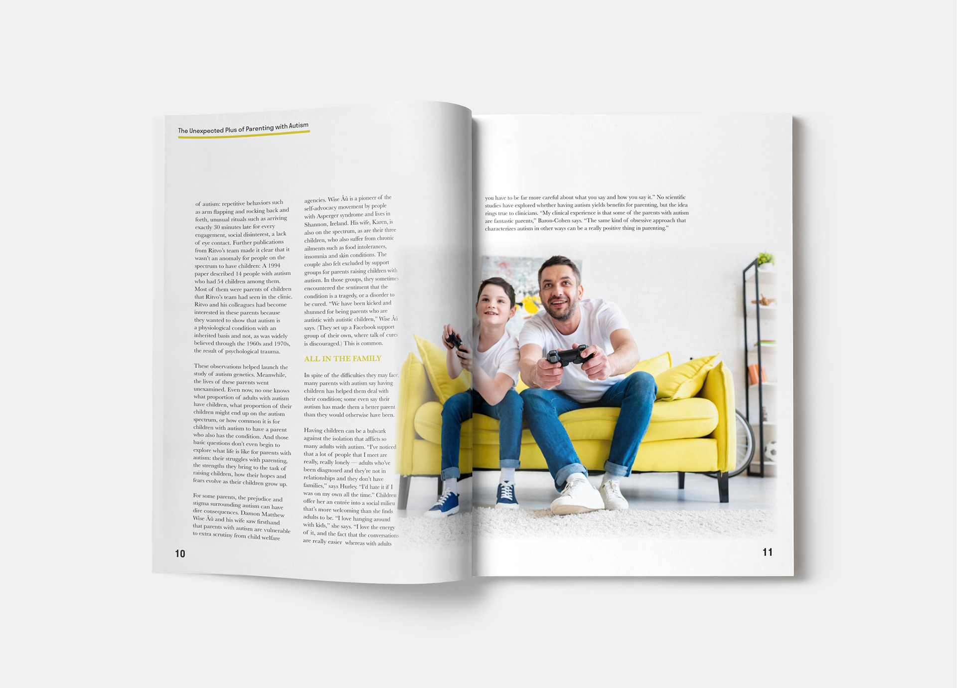
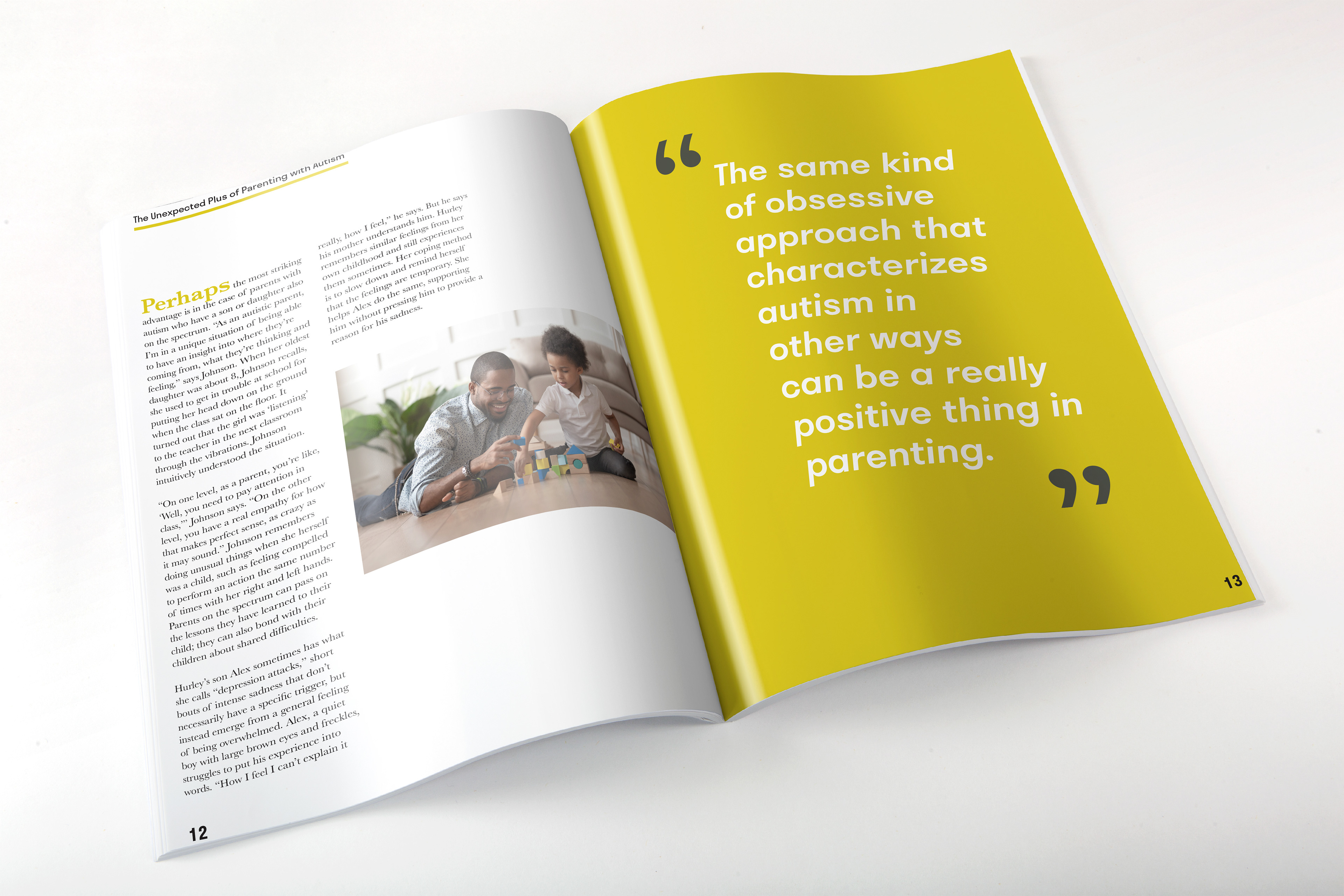
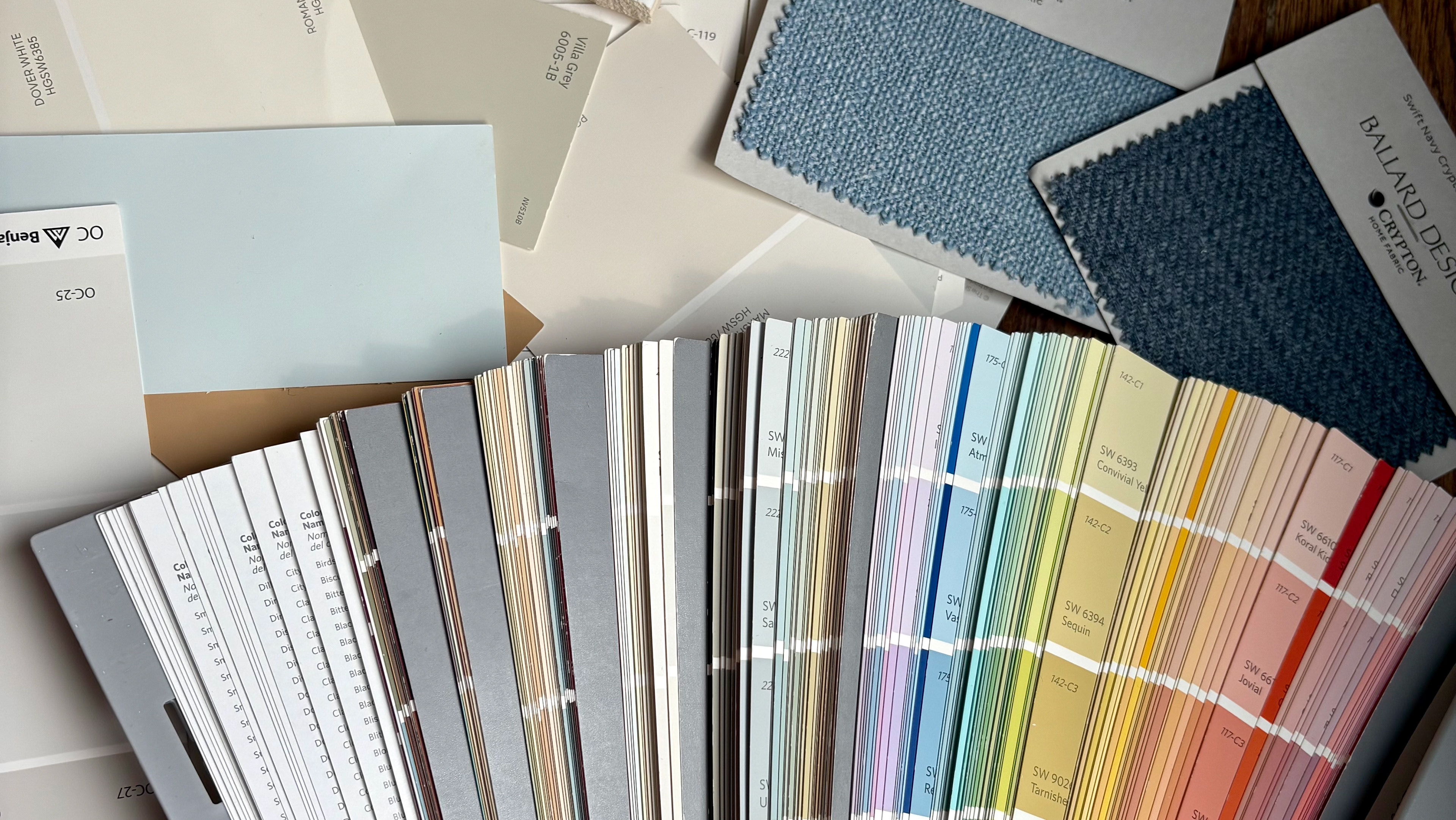
Sensory Magazine was a project intended to help me gain familiarity with copywriting, the importance of grid and hierarchy. The project included the limitation of image use, with 50% or less of the spread being photographs. Sensory Magazine is a publication that focuses on neurodivergent wellness and community. The colors were chosen because studies show muted colors are easier to read and less overwhelming for neurodivergent individuals.
